Bare Bones Boxing was growing and they wanted to fully elevate and transform their brand identity.
They needed a brand identity that properly represented their incredible gym experience and could drive growth to help them achieve their business goals.
Bare Bones wasn’t just moving their gym to a larger location. They envisioned bigger. They wanted to build a brand platform that has the potential to scale to multiple locations and become a recognized lifestyle brand.
We went through the five phases of The Wisdom Method™ (my strategy workshop) including story, consumer, positioning, core, and expression.
As we did this it became clear that BBB had something truly special going on and a treasure trove of untapped potential with their brand. They just needed to define it and package it up in a cohesive and compelling way.
We did just that. Through their positioning as as the rawest, classic, most original boxing workout experience, their brand identity found it’s direction. Once we defined their brand we had clear direction for designing the visual identity.
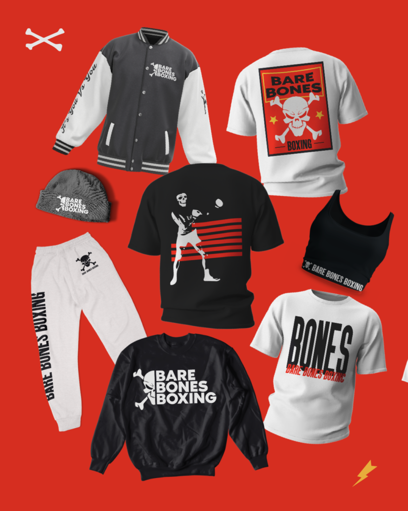
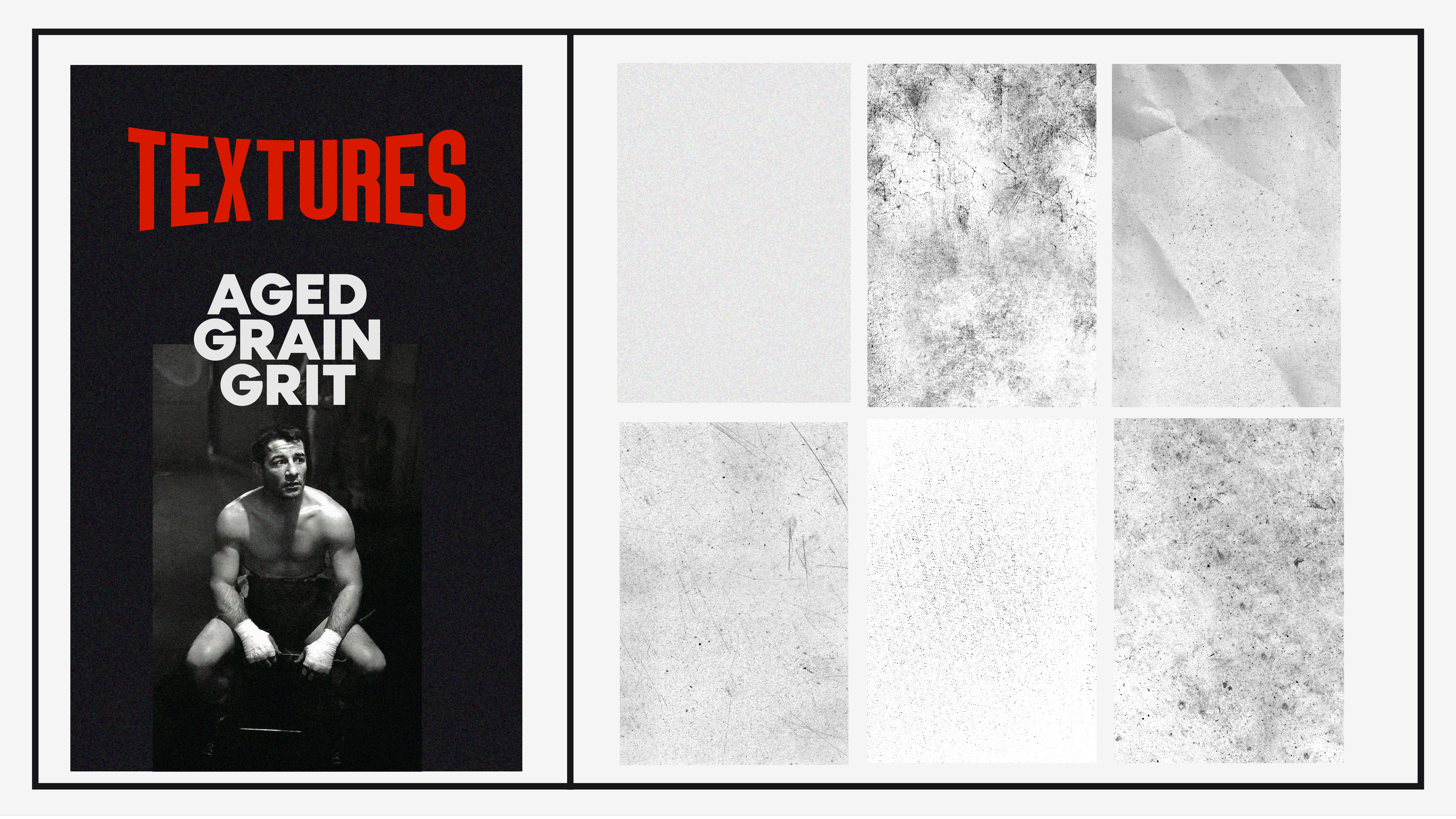
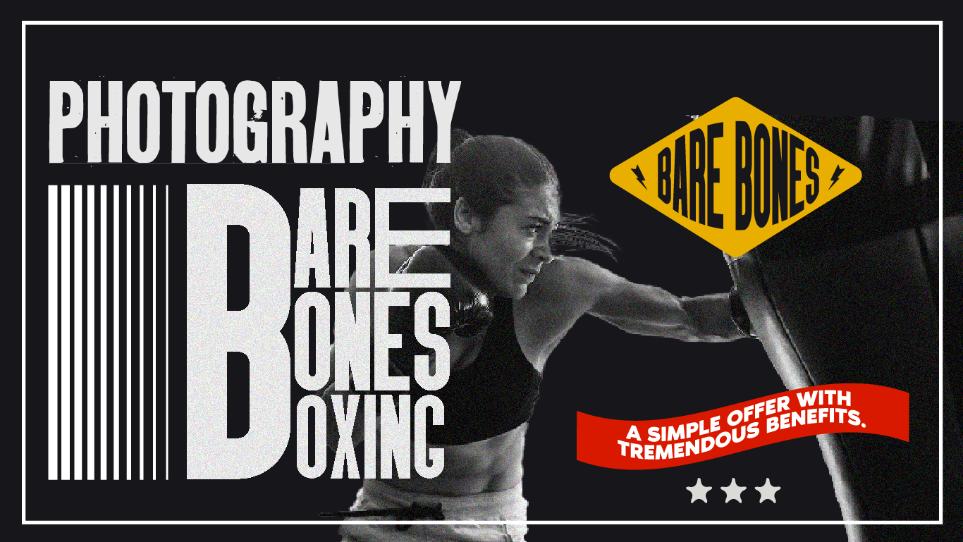
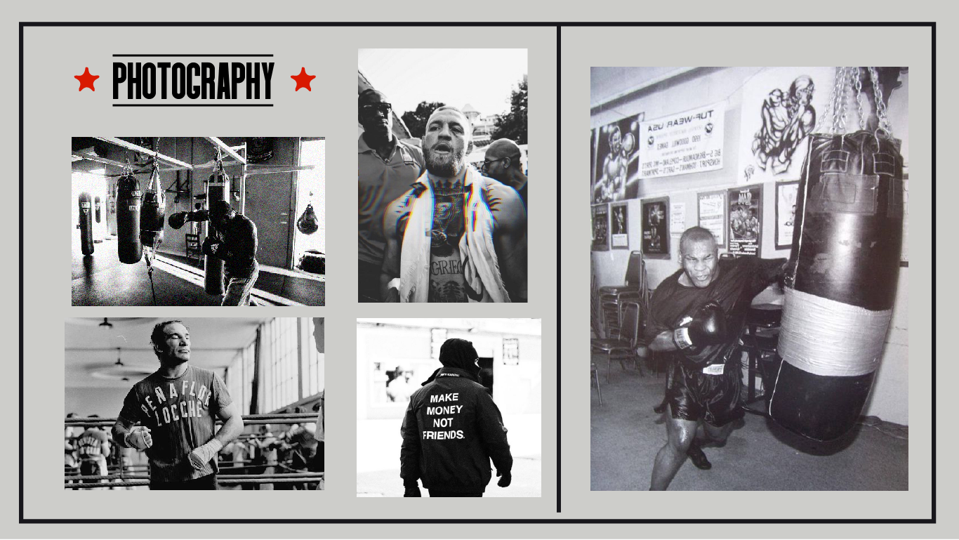
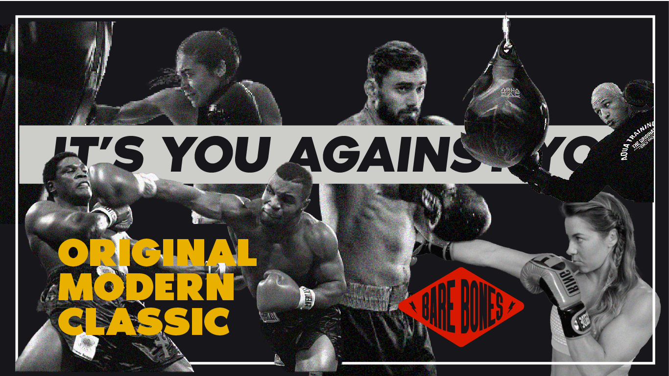
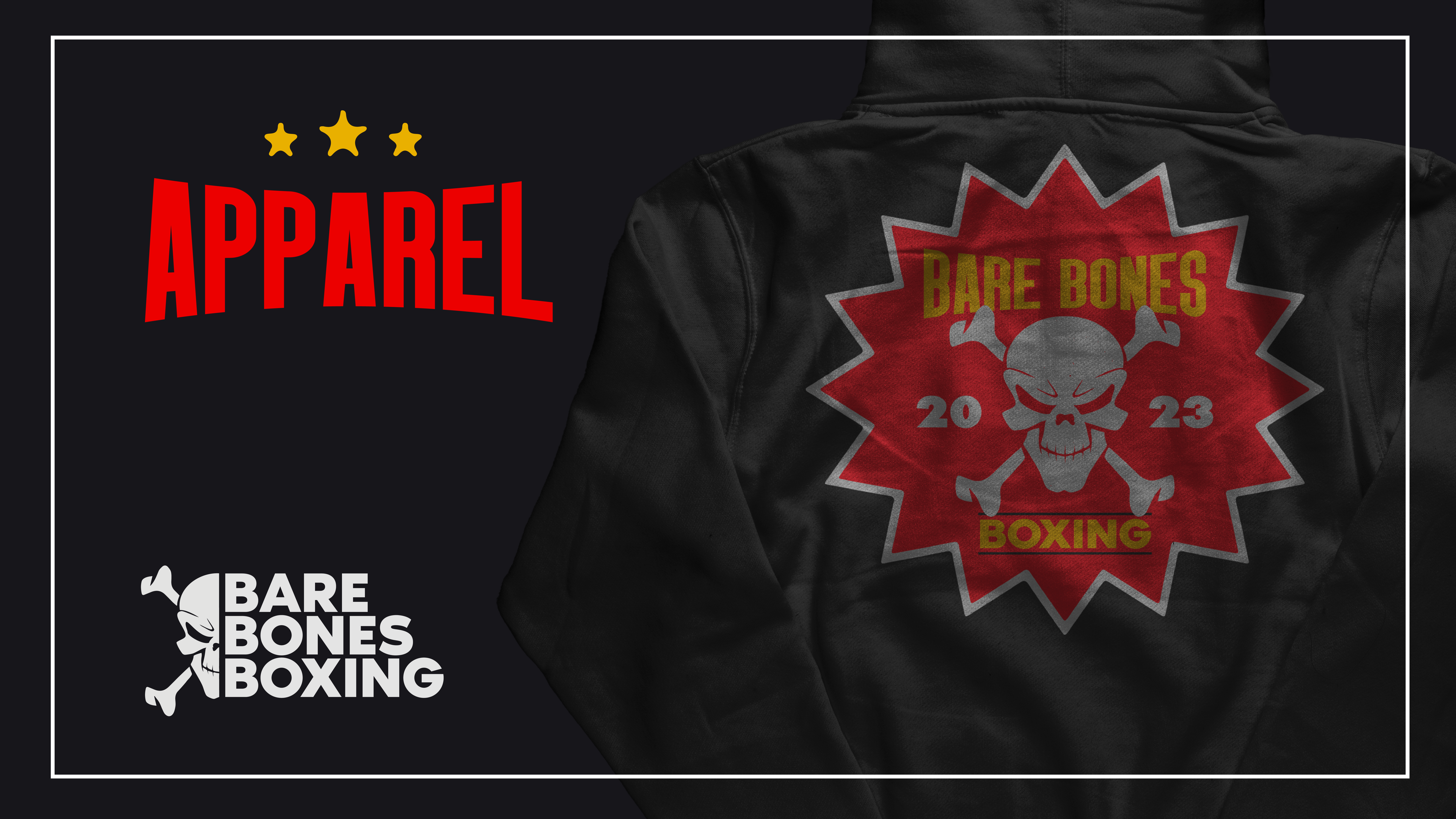
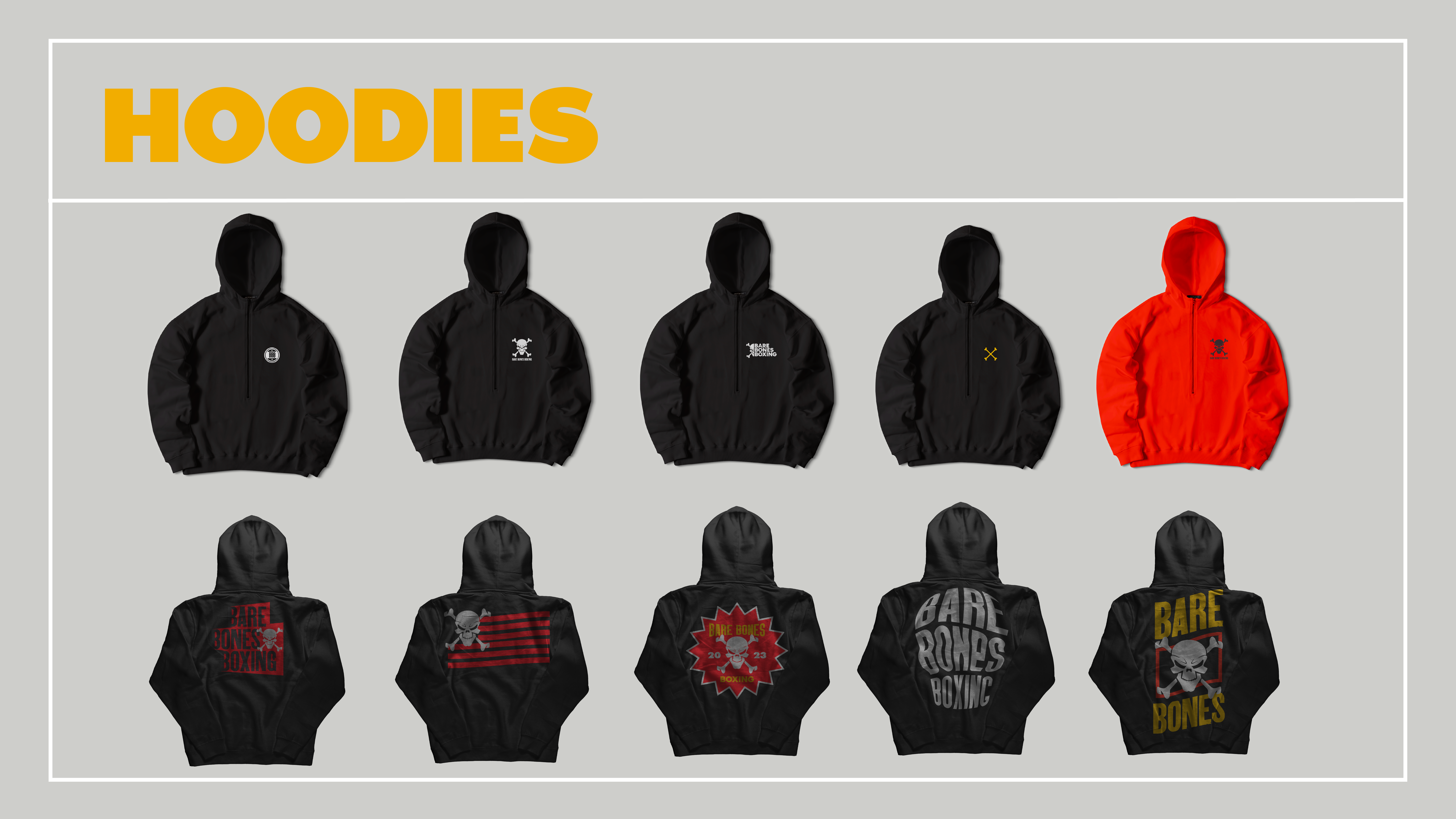
We designed a visual identity that was inspired by classic boxing posters for the colors, typography, and graphics to express their classic, raw, and original boxing gym brand positioning while using fun graphics to be approachable to their target consumers.
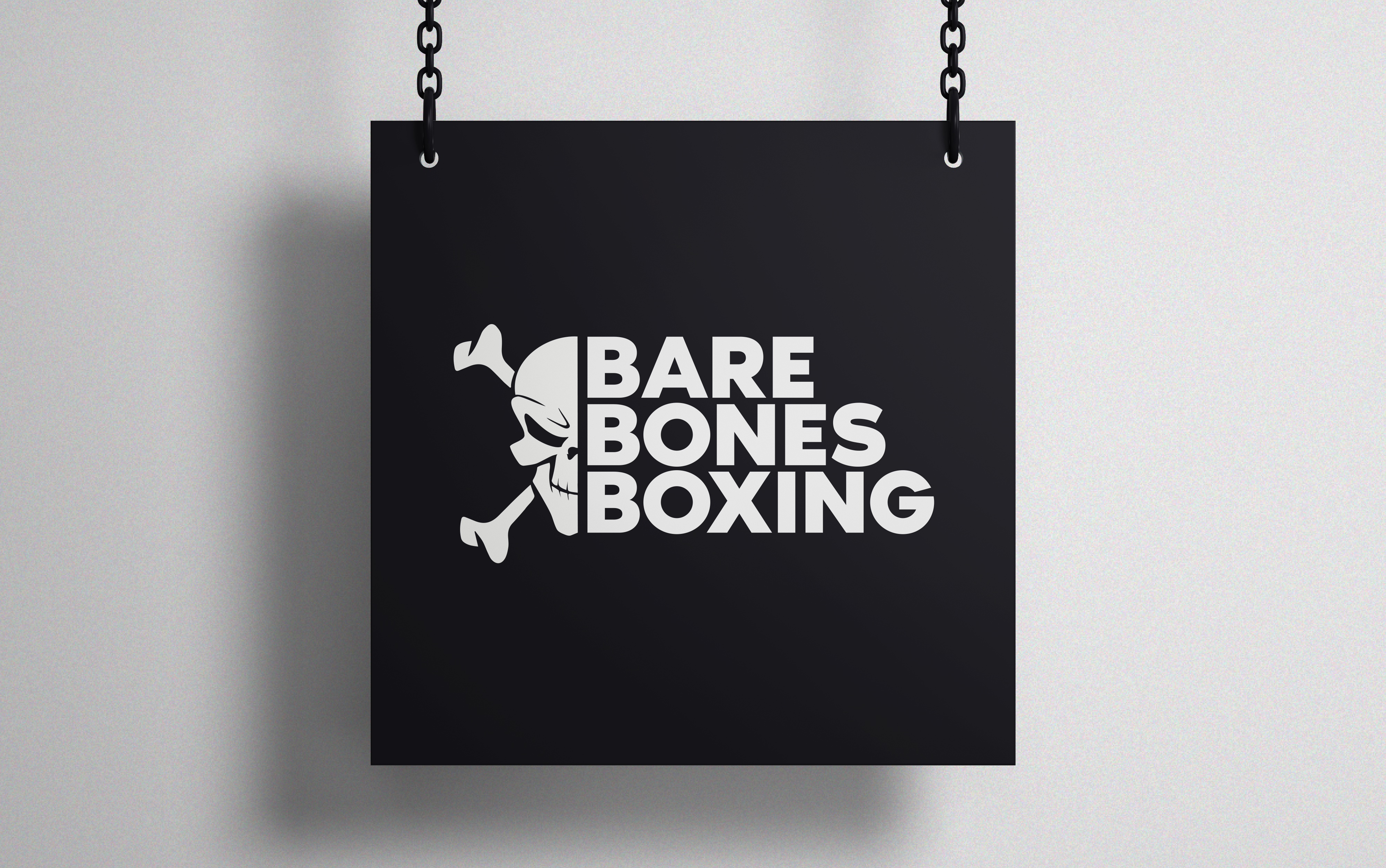
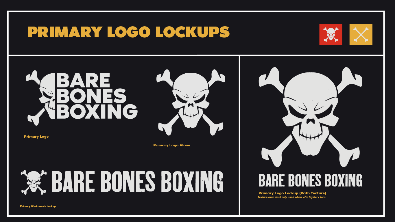
Though their old logo was dated it did have substantial brand equity already. We decided to modernize their old logo, creating a refreshed logo suite that would carry the Bare Bones Boxing brand into a new era.
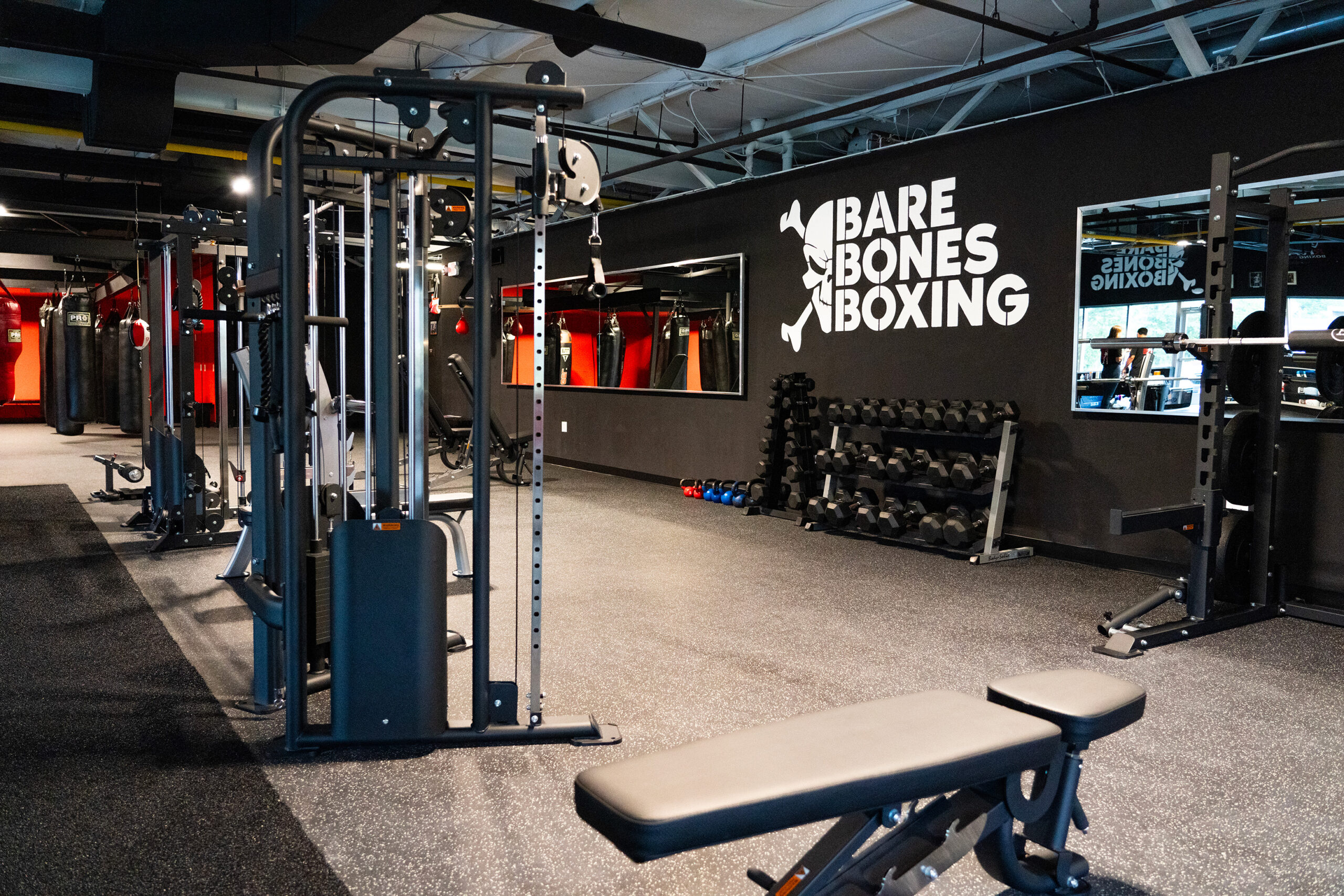
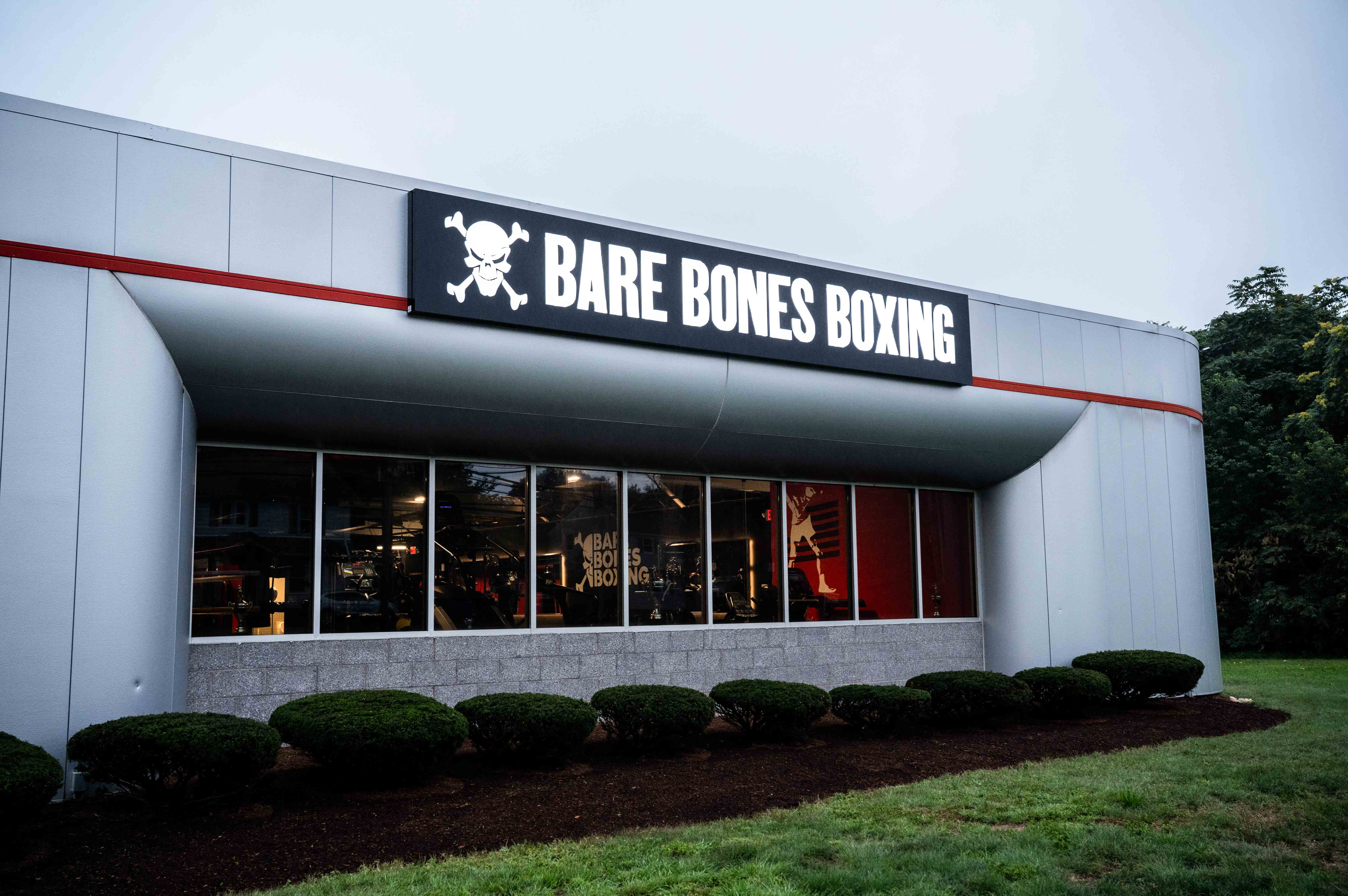
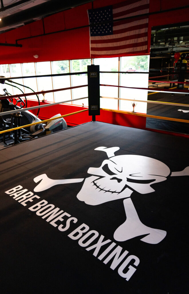
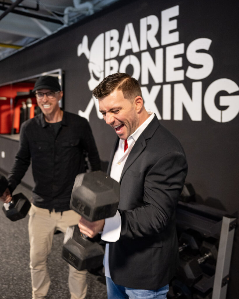
Bare Bones proudly opened it’s doors to the community of East Hartford, CT in August of 2023. The love for the new gym and branding was overflowing during their opening celebration. It’s safe to say the future is bright for Bare Bones Boxing.











Many business owners have underwhelming branding and it's turning customers away so we created The Wisdom Method™ to help business owners clarify their message, modernize their visual identity, optimize their website, and elevate their content so they can grow their business.
© 2015 - 2025 Wisdom LLC All Rights Reserved.
Many business owners have underwhelming branding and it's turning customers away so we created The Wisdom Method™ to help business owners clarify their message, modernize their visual identity, optimize their website, and elevate their content so they can grow their business.
© 2015 - 2024 Wisdom LLC All Rights Reserved.
